

Through Peace
Client: Through Peace / Esther Lim
Prompt: Create cover art for a booklet regarding race & bias education that will be distributed within all the schools of the Los Angeles Unified School DIstrict.
I was given the prompt and since it was for children from K-12 grades, I wanted to span all ages as well as different ethnicities, disability, discovery, and friendship within the illustrations. Each vignette is purposeful in showing relationships and creating belonging. I didn’t want to add facial features and create bias through them, rather I left the figures open for interpretation for students to imagine themselves as one of these characters.


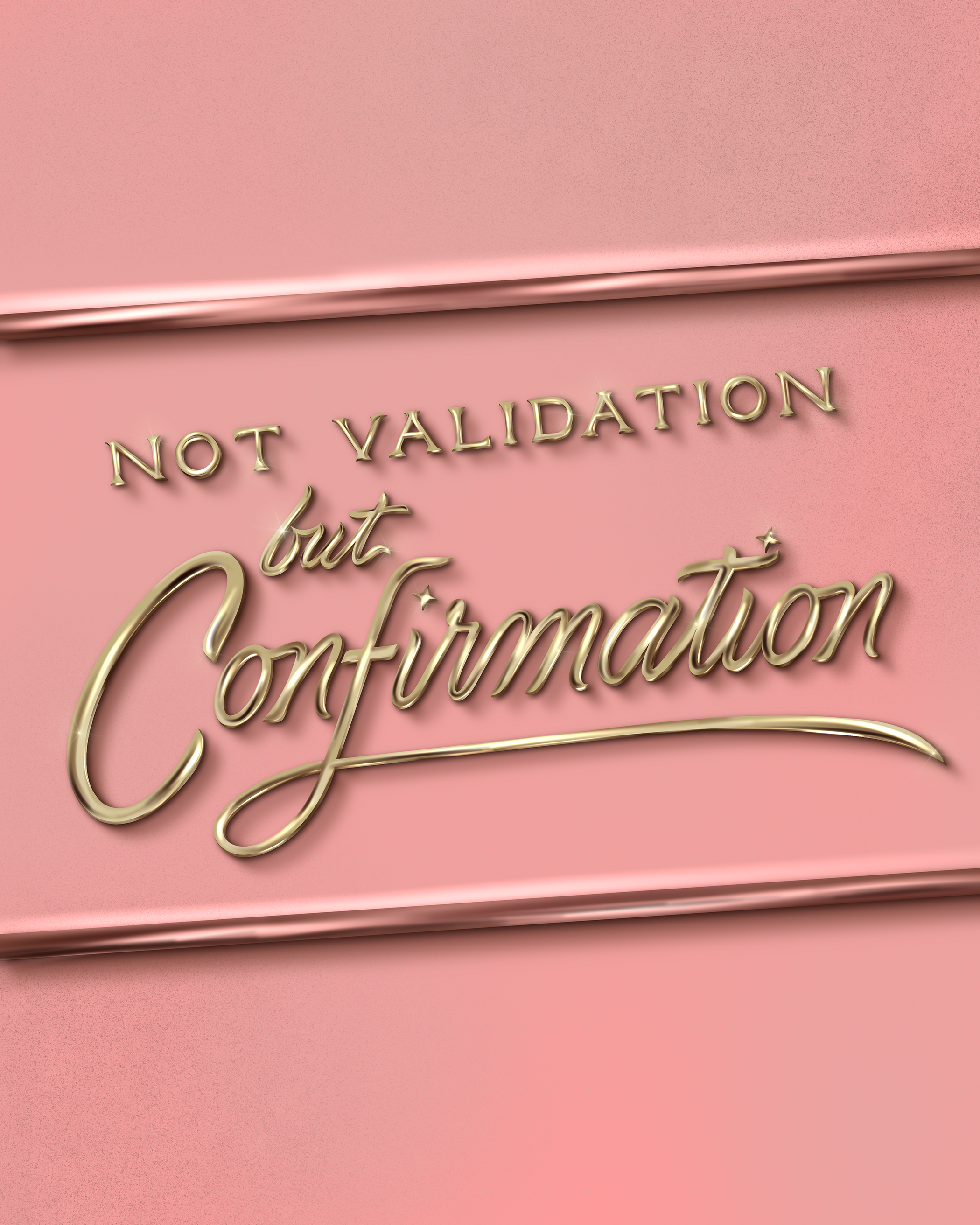
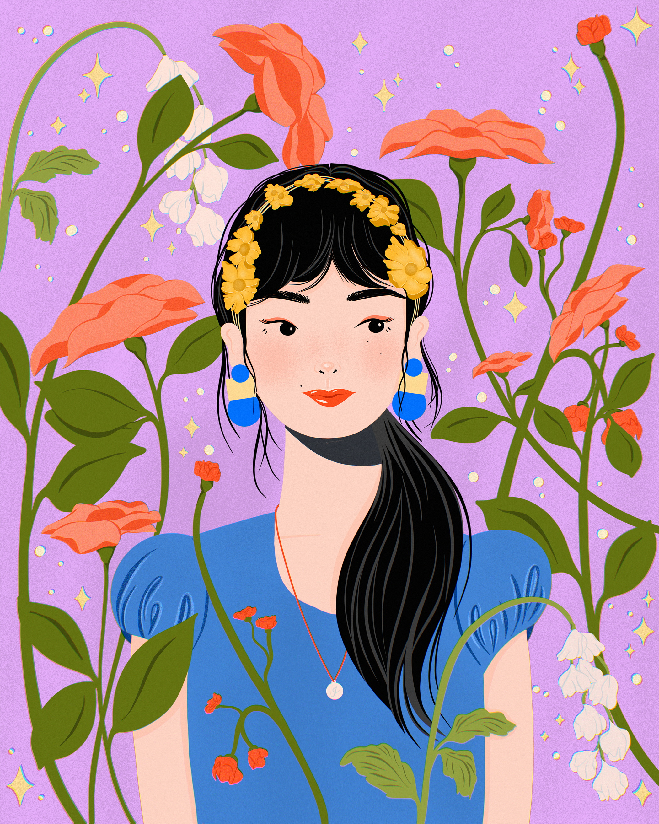
Celebrate AANHPI 2024
This piece was created for Asian American Native Hawaiian and Pacific Islander month. It was a personal piece in collaboration with several other artists to release and show the artwork representing our heritage and the collective Asian American experience.

Building signage
Client: One Colorado
Prompt: Directional mural for outdoor shopping area
The client came to me with an example of another mural and illustration asking for the floral treatment. I integrated their lettering request with the florals to wrap around the corner of the building.


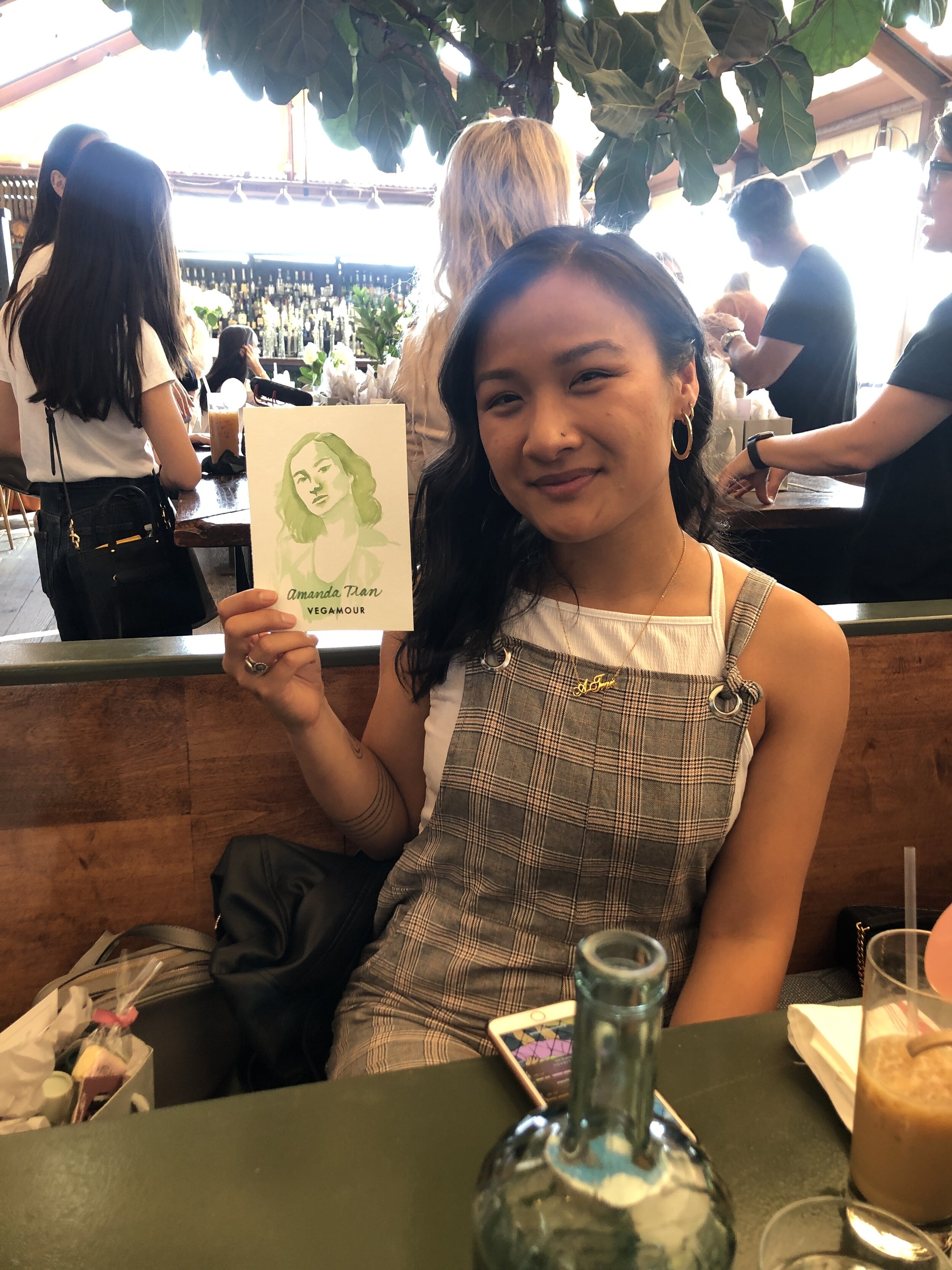
Vegamour
Client: Vegamour
Prompt: Place cards for each guest attending for the launch of the CBD infused serums
I wanted to be more creative about place cards and have people engaged with their seats. I suggested that if I could get all the portraits of the guests attending, I would be able to watercolor paint each guest.


Applegate Organics
Client: Cyrano Rox x Applegate Organics
Prompt: Create illustrations for their traveling food truck during their #baconexpress campaign.
I wanted this to be engaging and filled with a lot of visual markers for the brand. All the illustrations were treated to look like they were drawn on a chalkboard with chalk. Along with the illustrations for the food truck, I created chalkboard menu boards for display at each stop they made.

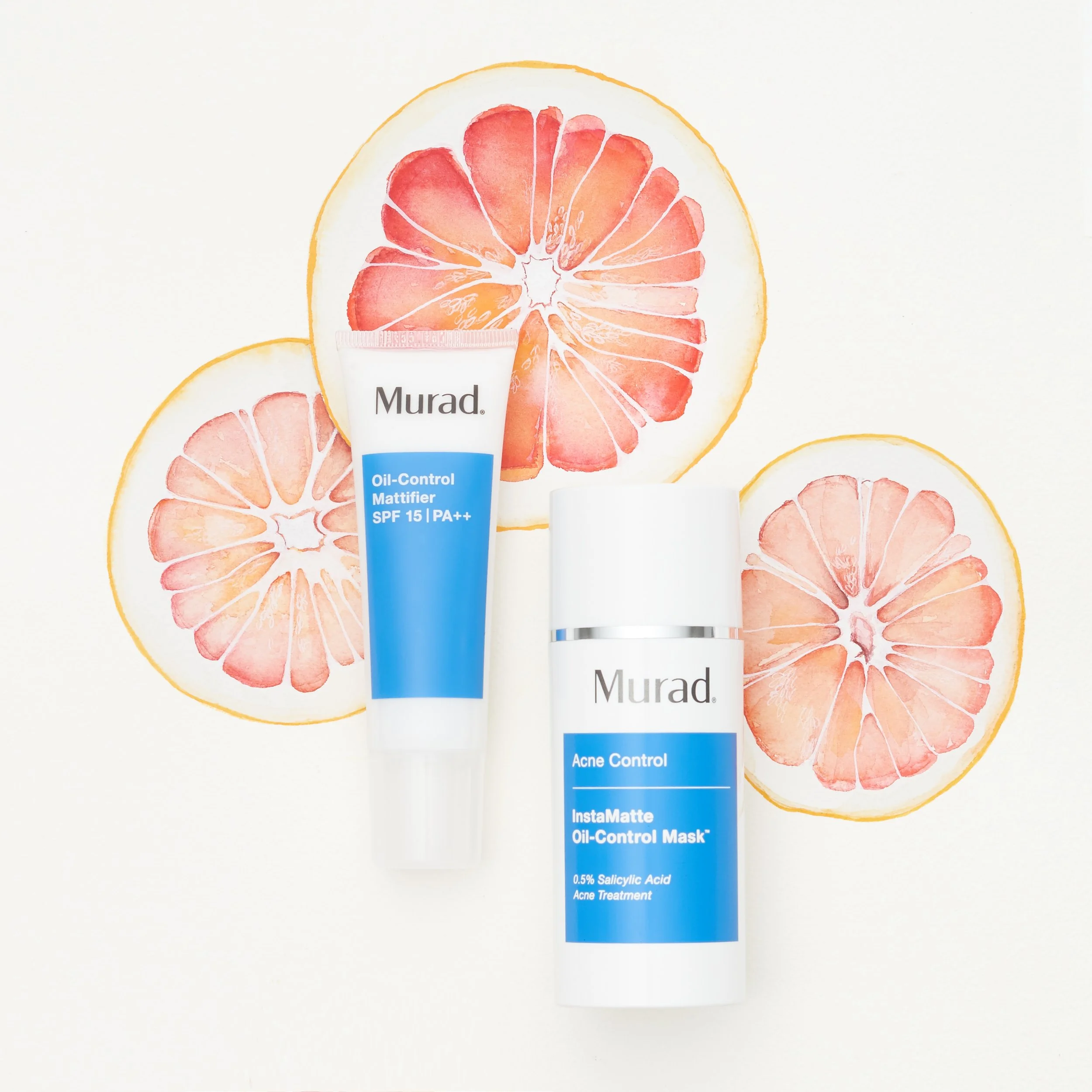
Murad
Client: Murad / Styling by Wilmarose Orlanes
Prompt: Create illustrations for the photoshoot that reflect the ingredients in the product
I wanted to keep this simple and fresh so I created the illustrations using watercolor. We agreed that there needed to be space and breathing room in specific areas where the product would lay.

Very Asian Foundation
Client: Very Asian Foundation / Michelle Li
Prompt: Create promotional artwork for their fundraiser with the words Very Asian
Left: This artwork was inspired by the Asian signature stamps that everyone had in place of handwritten signatures. It’s an ancient and old practice and was typically stamped in red to indicate the bind the person had with the agreement. Across many Asian culture, this practice has been used so I wanted to create a simple and dynamic lettering treatment that mimiced the very signature stamp. These were ultimately printed onto tote bags and sold for fundraiser purposes.
Right: This option was a variation that I wanted to create with a clean script and bold lettering. The final was printed onto t-shirts and sold for fundraiser purposes.


Tierra Blooms signage
Client: Tierra Blooms Nursery
Prompt: Create signage for a local business
The client asked for a new logo and signage for their business. They had built the frame and boards so I took it home and created bright signage that patrons can see from the street and driving by. This business has seen immense growth after the sign went up since the town knew what they were selling. It’s created a wonderful addition to the street.


Asian American Girl Club
Client: Asian American Girl Club
Prompt: Create social media tutorial, downloadable coloring page for members, and social media assets
AAGC highlights how to redefine the narrative surrounding that age old and all too familiar question: “Where are you from?” The answer is unanimous and powerful. We are from here. We are prideful beyond measure and gorgeously strong.
I wanted to create a unique take with lettering of the phrase in a different treatment. I used quilled paper and shaped each letter by hand for their live tutorial on social media. I also created a coloring page and illustration for them to use on social media celebrating Asian American history month.


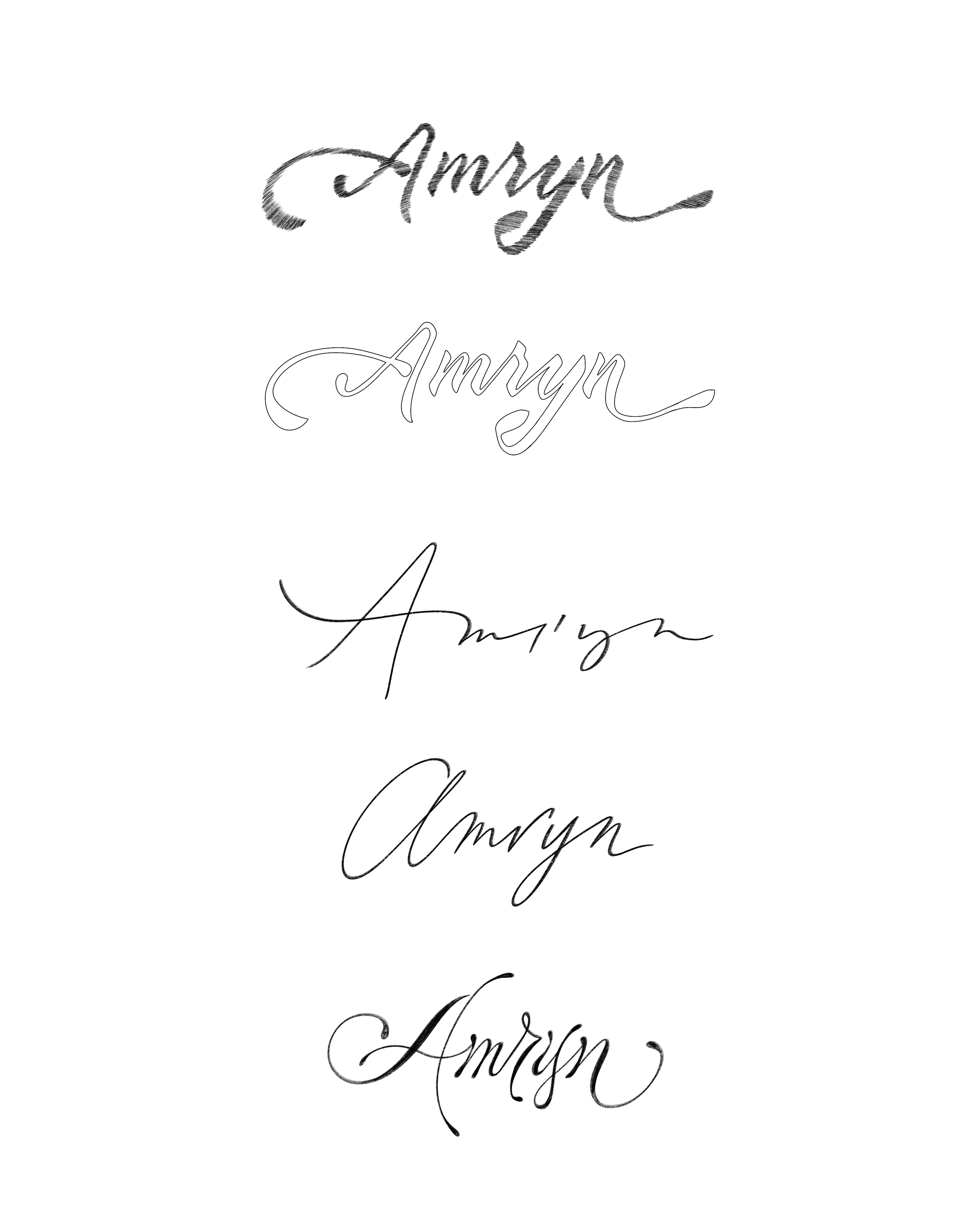
Amryn Wine
Client: Amryn Wine
Prompt: Logo and label for Amryn Wine
The client wanted to create a loose logo that mimicked handwritten lettering. She also wanted to make sure the label felt soft and serene. The illustration referenced a photo of a lake and mountains that she took from a trip to visit her parents hometown in China. To achieve this softness, I painted this with watercolor to help with the ethereal feeling.


Initial logo sketch process:

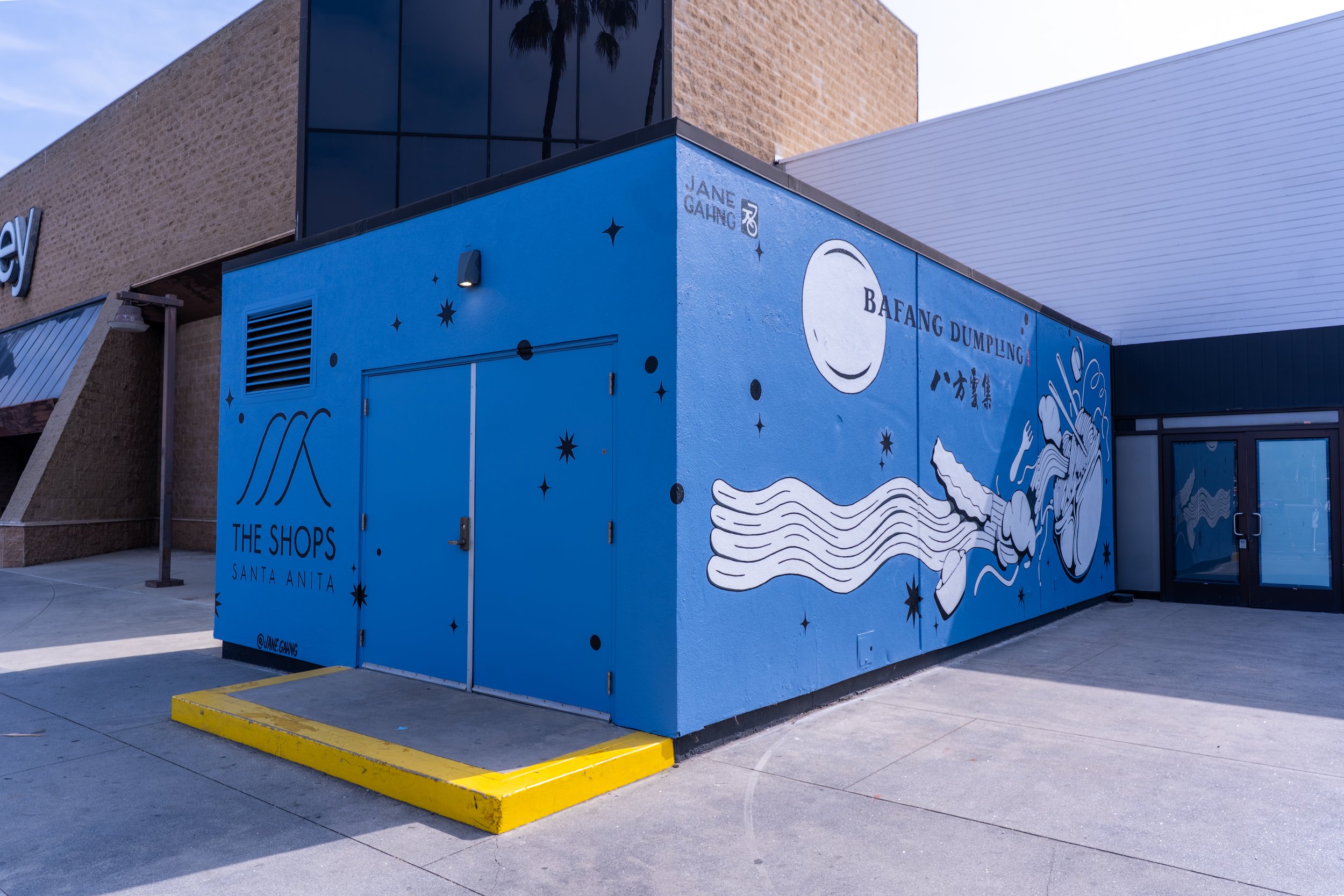
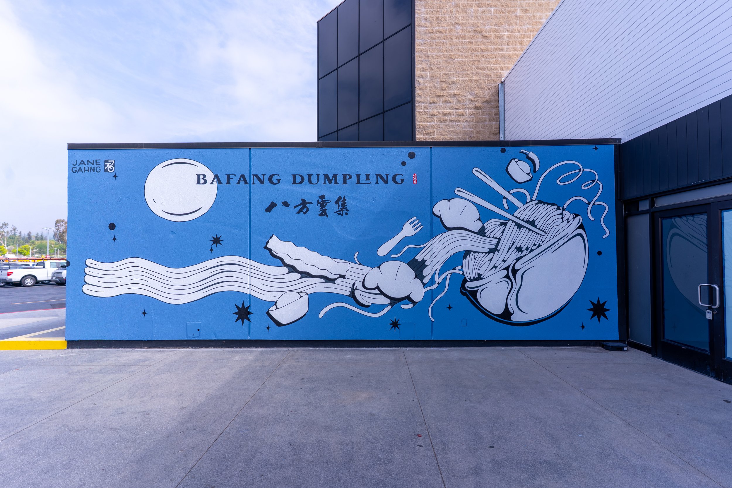
SASA
Client: The Shops at Santa Anita
Prompt: Create an outdoor patio mural for Bafang restaurant and the Shops.
I wanted to stick to the aesthetics of Bafang’s branding and fun illustrations. Since the mural would be located at the mall, I wanted to add in a nod to the mountains in Santa Anita with the noodle waves. The installation will be wrapped around the building so that it’s visible from the parking lot.

Draft sketches:


Badass Korean
Client: Very Asian Foundation x Korean American Community Foundation
Prompt: Usage of a previous illustration for the swag bags distributed during their annual luncheon celebrating Korean American women.
I had created this illustration in 2023 for personal work and presented it to the client as an option. After some tweaks to fit the theme, it was printed on tote bags for all the attendees to take home with goodies. It was an honor working for these two organizations!


